
ZEP Quiz
NAVER Z CORP
Many users landed directly from search with no context about ZEP Quiz. I redesigned the detail page to clarify the quiz, surface the right next action, and create natural paths to sign-up and paid features.
Role
Task Owner
Product Design Lead
Timeline
3 Months
(Sep - Nov 2025)
Team
NAVER Z Corp.
ZEP team
Context
94% of users reached the quiz detail page through organic search, making it their first encounter with ZEP Quiz. The page had to explain the service and make the next step clear.
Problem
The main CTA in the bottom floating action row had under 5% CTR, and more than 80% of users left within 15 seconds.
Solution
Quiz Detail 2.0 turned the page into a clear starting point with a visual quiz header, a two-column layout, an action rail that adapts to each user, easier-to-scan question cards, and related quizzes for continued discovery.
Outcome
Dwell time increased by over 128%, entry click rate increased by 64%, and signup rate increased by 88%. The flexible structure later absorbed additional features and swappable CTAs
AVG. DWELL TIME
+128%
users stayed longer after the redesign
QUIZ ENTRY CTR
+64%
users clicked to enter a quiz
SIGN-UP RATE
+88%
users continued to sign up
BEFORE

AFTER


Defining Problem
SEO turned the detail page into the first product experience for 94% of users.
Most new users bypassed the main page and landed directly on individual quiz pages from search. A page originally designed to display quiz content now also had to introduce the product, establish context, and guide the next action.


→
The Problem
The main CTA was missed, and users left almost immediately
The main CTA in the bottom floating action row stayed under 5% CTR. More than 80% of users left within 15 seconds.
The page looked like a document, not a quiz
Without a clear visual identity or preview structure, users could not tell they were looking at an interactive quiz.
The main CTA stayed under 5% CTR
The bottom floating buttons did not make the next step visible or explain that Enter would start the quiz.
More than 80% left within 15 seconds
Users had almost no time to build an understanding of the service before leaving.
Key Decisions
Design the first visit around a clear next action
Core idea

For first-time users
Explain the service at a glance, let them preview the quiz, and make the first action unmistakable.

For returning users
Adapt the actions to their context—copy or try someone else’s quiz, or enter, edit, and review their own.
Design Output
Final Design


Final Design : Bringing the Quiz Experience into One Clear Flow
The final design brings quiz context, questions, game elements, and key actions into a clear hierarchy. Each part of the page now supports the user’s journey from understanding what the quiz is to previewing content and deciding what to do next.

Contextual Sidebar : Adapting Actions Based on Quiz Ownership
Reorganized page actions into a contextual sidebar that changes depending on whether the quiz belongs to the user or someone else. This makes available actions easier to understand while reducing clutter in the main content area.

Map Banner : Bringing Game Context into the Quiz Page
Integrated the selected game map into the quiz detail page as a visual banner. This makes the gameplay context immediately visible and helps distinguish quizzes that use different maps or premium content.

Related Quizzes : Extending Discovery with Related Quizzes
Added related quiz sections at the bottom of the page so users can continue exploring similar content without returning to search. This creates a smoother discovery flow and encourages longer sessions.

Login Gate : Balancing Preview and Conversion
Guest users could explore the first three questions before being prompted to log in. This gave first-time visitors enough value to understand the quiz experience while creating a natural conversion point for deeper exploration.
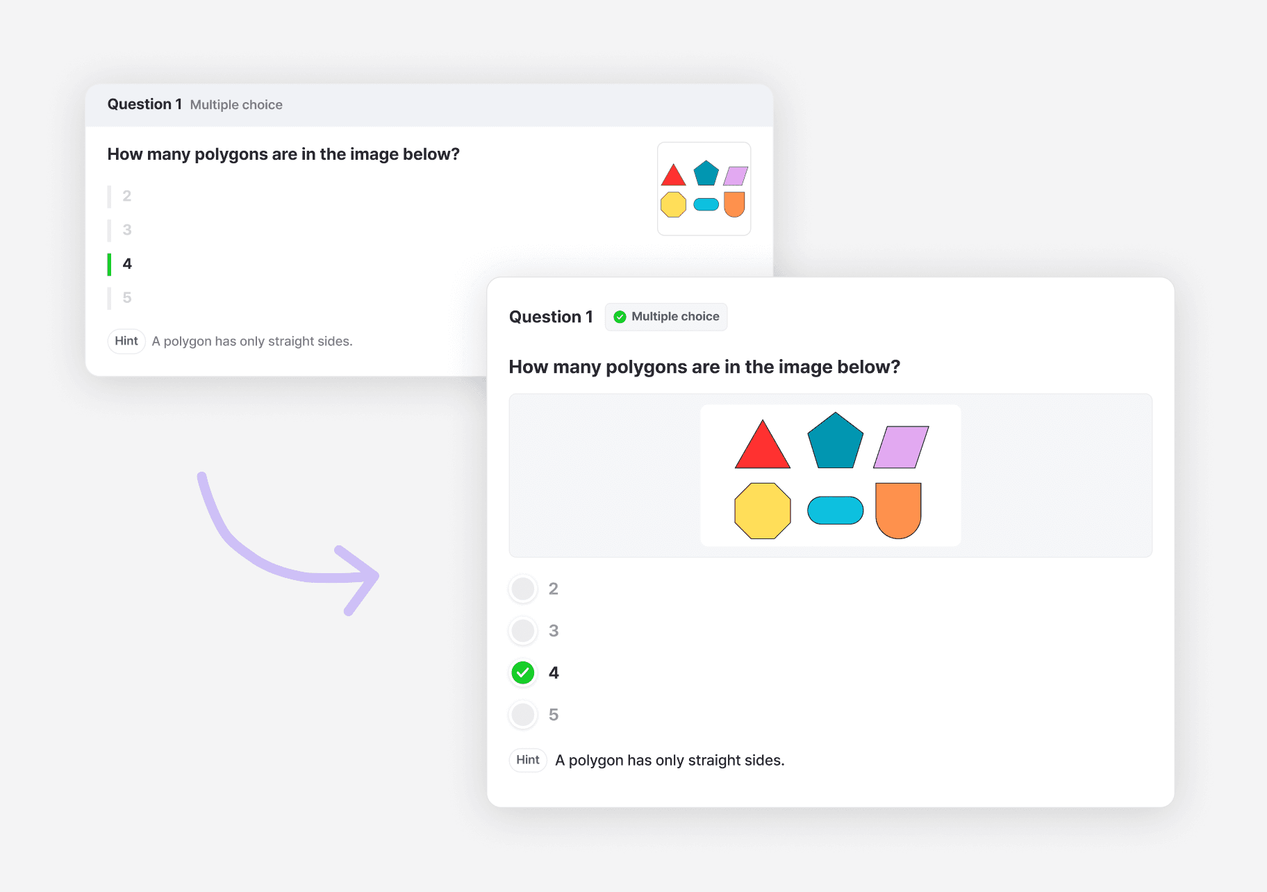
Question Card Design : Improving Question Card Hierarchy
Redesigned question cards to create a clearer hierarchy between the question, answer choices, media, and hints. The new layout improves scanability and supports different question types more consistently.
Impact
People stayed longer and entered more often
Dwell time
128%+
increase after the redesign.
Entry click rate
64%
increase after the redesign.
Signup rate
88%
increase after the full question preview was gated behind login.
The next step became visible
The entry and key actions moved from the saturated bottom row into a visible rail near the top.
Read as a gamified quiz
Cover artwork, quiz information, and visual question cards made the content easier to understand.
The visit could continue
Popular quizzes by the teacher and related quizzes from the same category gave people a useful next path.
Reflections
What I learned.
Acquisition context should shape the product experience.
Users arriving from search behaved differently from existing users because they lacked product context. Designing the detail page as both a destination and an onboarding surface helped align acquisition, comprehension, and conversion in one experience.
Feature growth requires stronger product hierarchy, not more interface.
s the quiz page accumulated more actions, the challenge was no longer adding functionality but defining which actions mattered in each context. Separating primary, secondary, and ownership-specific actions created a structure that could scale with future features.